Unless you’re a seasoned design pro, or have dabbled enough in web design that you feel pretty confident, you may be in need of some essential tips when it comes to making your page as attractive as you are. Onescreener gives you all the tools to build your “link in bio” effectively and efficiently. Well, Onescreener IS your “link in bio”!
I’ll cover five key points here that you should keep in mind when you’re getting ready to create your Onescreener website.
- Choosing your background image/ photo
- Making your Text Logo
- Assigning colors to your Text Logo and link icons
- Choosing your Content Items
- Deciding on the composition/ layout of your page
Background
Because the most graphically present part of your Onescreener site is your background image, it’s important to choose one that immediately gives viewers a clear impression of your brand identity. If you’re a musician, think about how the image you wish to use tells your audience what you might sound like, and what might be your current style or vibe. If you’re an influencer, perhaps you want your image or photo to portray your key interests or causes. Your image should showcase WHO YOU ARE and/or what you have to give.

Onescreener allows you to set your background image as Full Screen or Fit in Screen. Full Screen, when you have a strong image, tends to make a big impact. Fit in Screen can also be great if you want to showcase a complete album cover, for example. In either case, it’s best to use a high resolution image. If you don’t have a professional high-res image that suits your current needs, try taking one with your phone. There are many cool digital photo editors out there that can help turn a not-so-great photo into something special. Download Snapseed, Pixlr or InShOt as potential go-to tools.
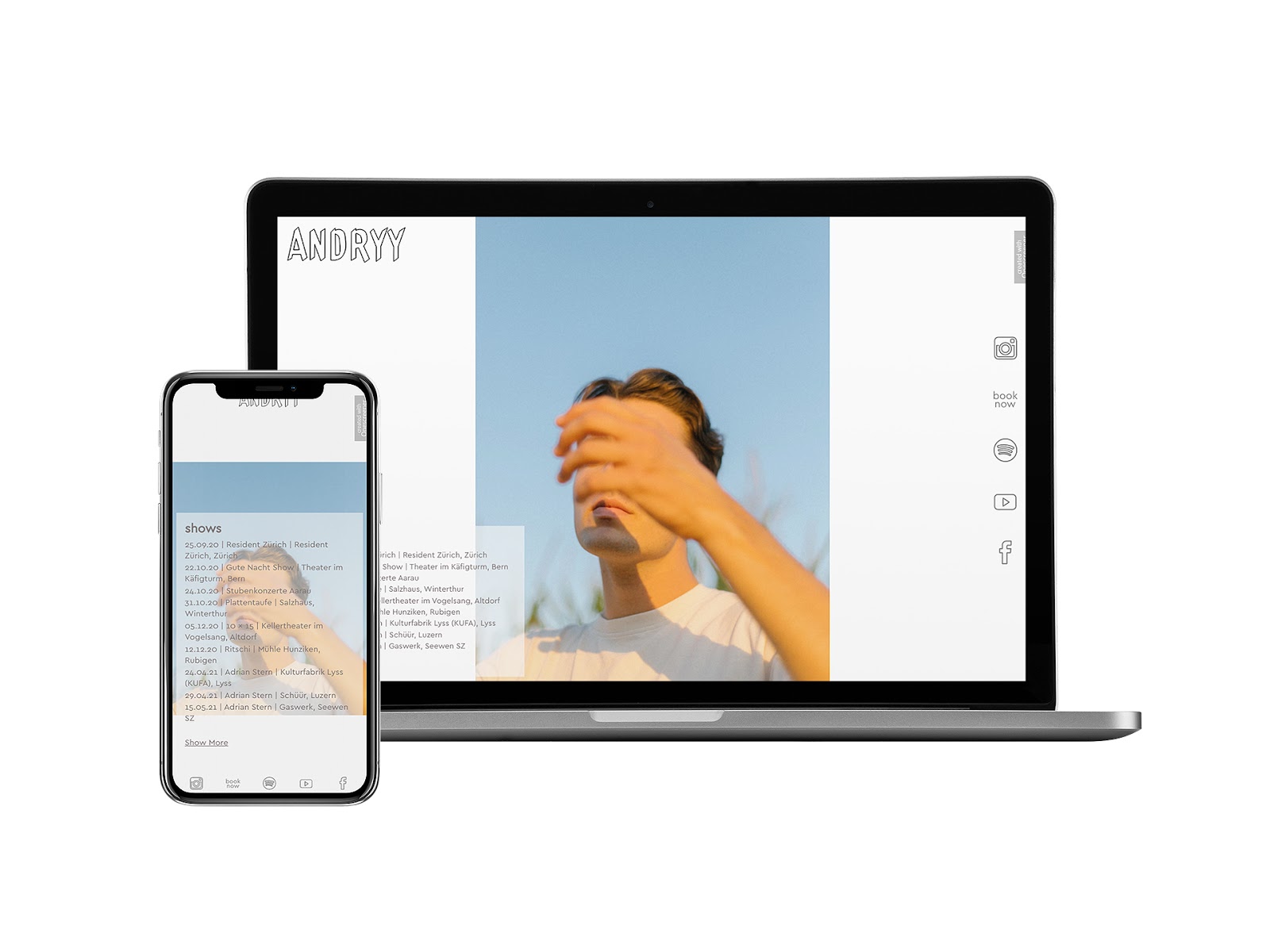
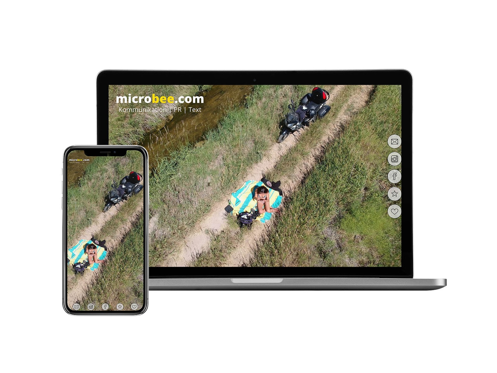
Besides considering what your image says about you, also consider what colors are in it and how the main subject (you?) is placed. Are the colors bright and cheery, dark and melancholy or neutral? Colors speak volumes. Make sure that they are on point with your brand. Often on Onescreener, images that have a center focus point work best. If you are at the center of your image, you’ll have more space to play around with when it comes to adding the other elements to your site. In the Onescreener below, for example, the user has chosen a landscape-based image with a center focus point. This allows them to play around with the added elements while leaving breathing room for the image itself:

Text Logo/ Font
If you’ve opted until now to use the Basic plan on Onescreener, you can choose to add a Text Logo to your page. Simply type in your name, business name or title, choose your font, it’s color and size, and decide where to place it (the final section of this entry covers composition, don’t forget). The key here is to choose a font that matches well with your brand. Something too playful paired with a serious background image, or vice versa, could be off-putting. If your image is modern-looking, go with a font that also has a modern touch; create some harmony between the elements.
Text Logo and Link Icon Colors
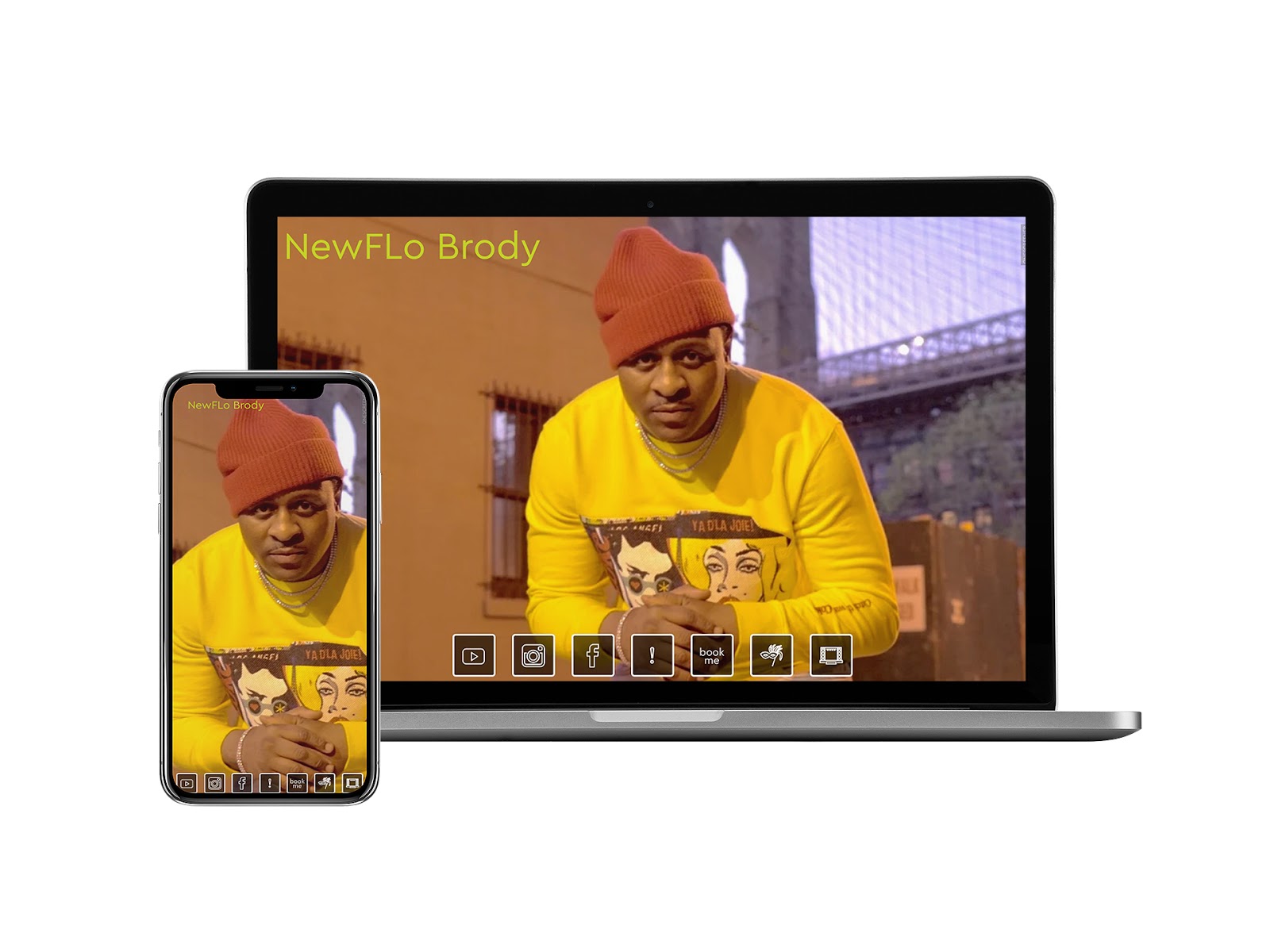
When choosing the colors of your Text Logo and icons, one of the easiest approaches is to pick a color that already exists in your background image (when it’s a colorful image). An eyedropper can be a handy tool to use for this. Just download one to your desktop or mobile, and you’ll have quick access to any color on your screen. If your background is black and white, it may make sense to use a primary color. In either case, choose one that stands out against your background, making it easily visible to those who visit your site for the first time. Also consider the feeling the color conveys with respect to your background image and the general vibe of your brand.
Your icons are also customizable in terms of both color and size, and you can choose different colors for when they are active or inactive. Treat these in a similar way as you do your logo with regards to color choices. Most chances are, if the colors are in your background image already, they’re going to flow nicely on the page.

Content Items
The Pro and Premium plans on Onescreener allow you to add a Content Item to your page. This can be a music player, YouTube video, a livestream, or a body of text, for example. As you’ve already done with your background image, really think about what this piece of content says about you and your brand at this very moment. Is the content current? Is it some of your strongest work? Does it mirror the elements that you’ve already added to your site? Does it showcase strength in numbers (e.g. lots of likes and shares and fandom)? You want to create a harmonious flow between the elements, so your video or player should include content that goes with your site’s established mood. If your items just aren’t as up-to-date as you would like, perhaps it’s better to leave it off of your site. Instead, focus on directing people to your links where they can find the work you want them to see.
Composition/ Layout
Last but not least, think about how you’ve placed the various elements on your page in relation to the background image. Are key features of the photo or design being covered up? Is there too much space on one side of the site, and the other is crowded? Can people see your logo? And when you’ve added a video player, is it cutting off half of your face? It’s important to preview these elements in both the desktop and mobile views, as they can change quite drastically. Leave space for your background to make an impact!
An effective Onescreener site is one that is clear, has an immediate impact on the viewer, tells people right away what your brand/message/mission is all about, and that leads people to take action. You want them to think your site is cool enough that they are encouraged to click on your links, your players and your merch shops.
Designing your Onescreener is a fun process! Keep these points in mind when creating yours, and you’re bound to make something beautiful to share with the world. Who knows, maybe we’ll even feature it here!

.png)


