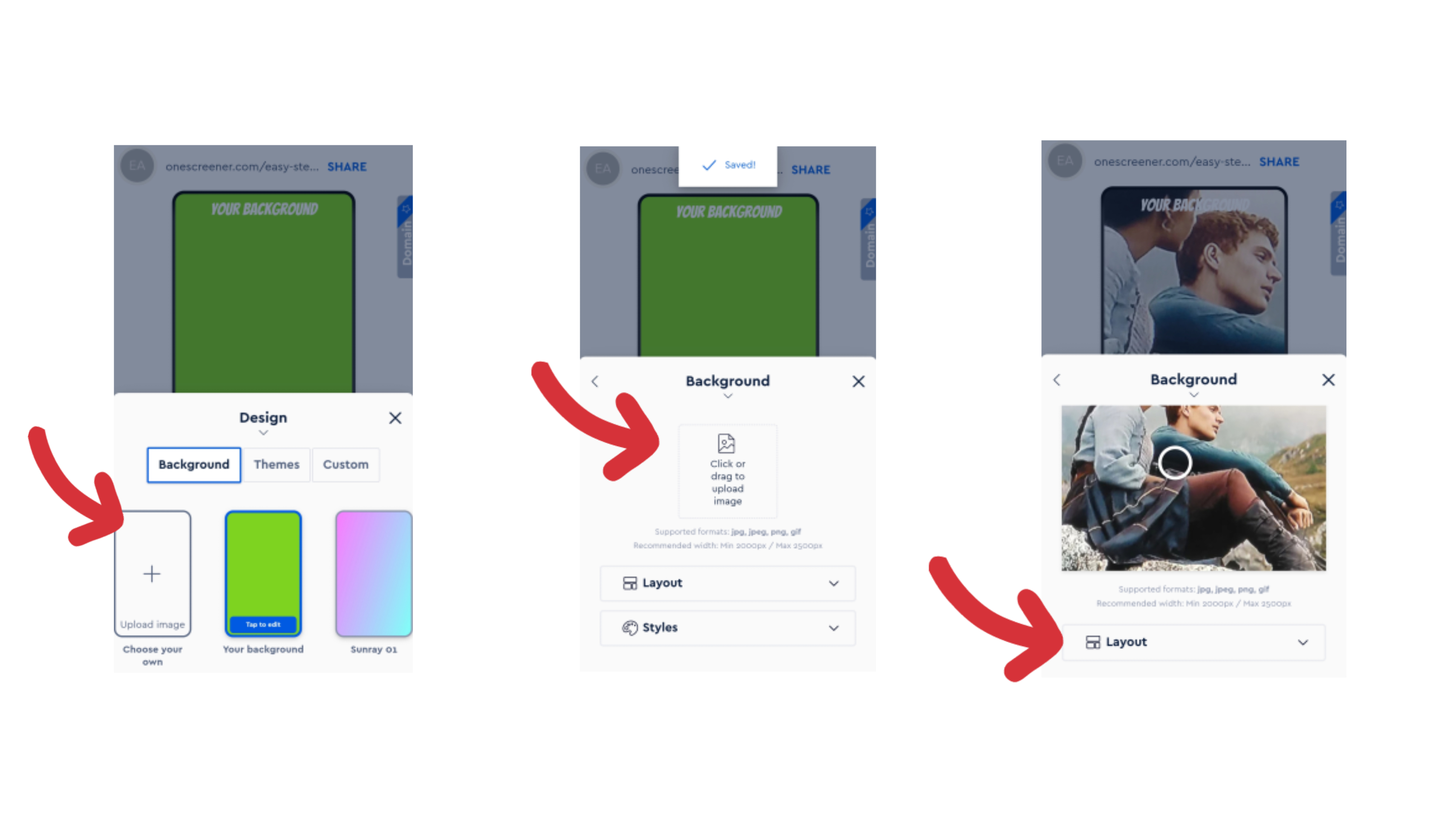
One important thing to consider after upgrading to the Pro or Premium plan (and accessing more design features!) is your Background image. A high-res, high quality photo or stylized image is always recommended, and it should be one that strongly represents your brand.
Image Position and Background Colour
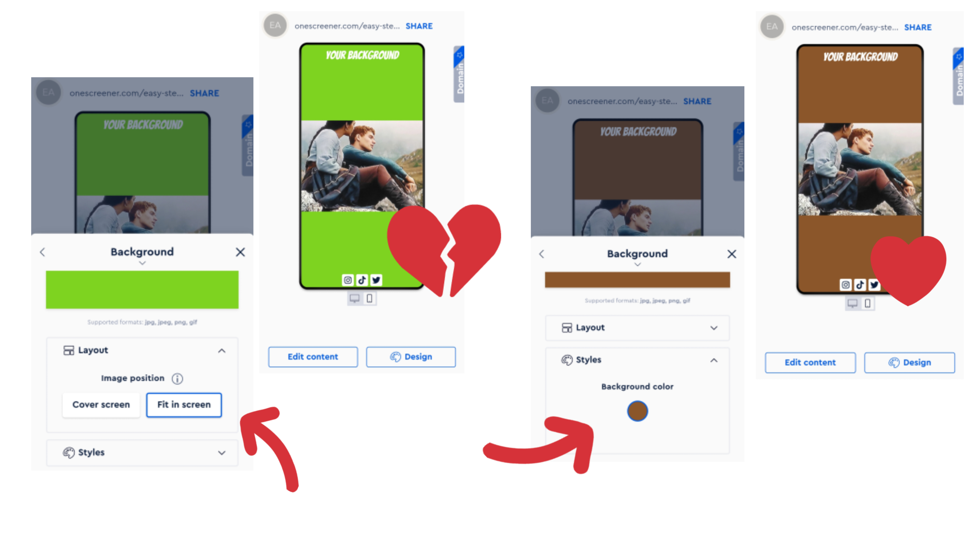
After uploading an image, consider its position on your site. Onescreener gives you the option to fill the page with the image (Cover screen: maybe a band photo or portrait), or to Fit in screen with a background color showing on the sides or top and bottom (great for featuring an album cover, for example).

When using the Fit in screen option, you will want to choose a Background colour that suits your image and design.

NOTE: If you're planning to use an artist or band/group portrait, the images that tend to be the easiest to work with are ones that feature space around the person/people. This way, when you add links and a video, for example, those things do not cover the person - they sit in the space around them. Landscape or horizontal formats work well.
Focus Point (When using Cover screen image position)
Onescreener provides you with the ability to choose where the Focus Point of your image will be. The Focus Point directs the placement of your background as you switch from desktop to mobile viewing, and keeps that designated part of the image within view. Because your image usually fits neatly within the desktop view, any changes to the Focus Point here are subtle. The image changes dramatically in the mobile view, however, as the screens are such different dimensions.
You may have to adjust and preview the Focus Point several times as you add content and icons to your site.


